Accidentally recreating Reframe on my portfolio
I told my partner the new portfolio would take two days, and somehow ended up building a live thumbnail studio inside the homepage grid.
Post
When I started putting my new portfolio together, I went through all five stages of portfolio: telling my partner it would only take two days (denial), digging through a decade of old Figma files (anger), rebuilding my 1998 website from the Wayback Machine instead of finishing case studies (bargaining), remembering I’d have to post on LinkedIn when I finished (depression), and logging in anyway because I needed a job (acceptance).
Rebuilding the 1998 website was only my second-biggest detour. The biggest one started with a single thumbnail.
The homepage is a grid of work from the past ten years: desktop apps, design systems, marketing pages, charts, and dozens of phone screens. By the time I had dug everything out of my old folders, there were 181 thumbnails arranged in a neat grid on my homepage.
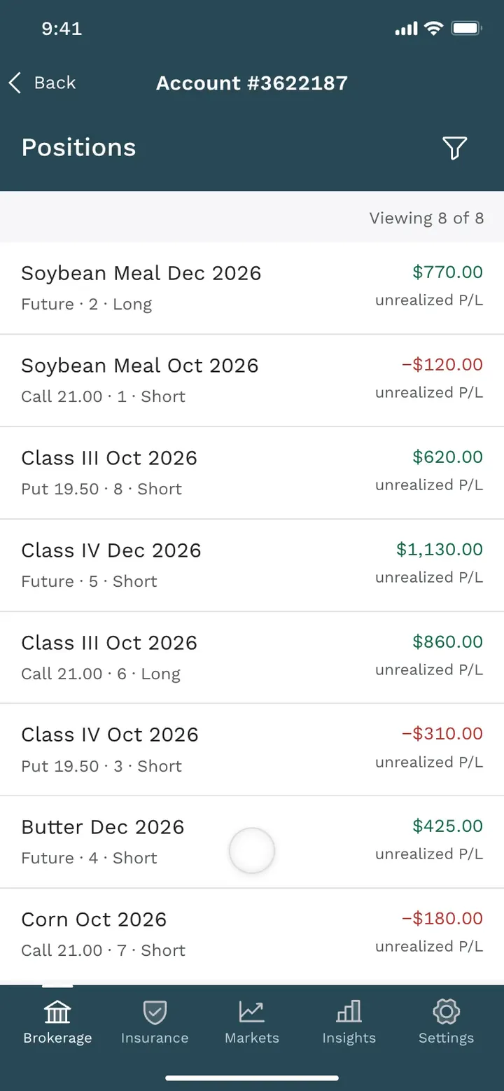
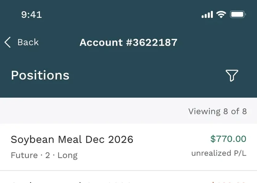 The card on my homepage
At first, I just dropped the raw screenshots into the grid and let the browser crop them to fit. Take “Reviewing a brokerage account,” a tall phone screen from an Ever.Ag trading app. The browser kept the top of it, which meant the card on my homepage showed a status bar, a back button, the word “Positions,” and one row of the list the screen was actually about.
Desktop screens fared a little better, but headlines got chopped in half and white app screens ran straight into the page background.
Fixing 181 thumbnails one at a time sounded like the kind of work I’d do almost anything to avoid, so I worked with my agent to devise a scheme to frame them all automatically. This involved a script that gave each screenshot a layout and pulled a soft background tint from the image itself. After that, I went through the proposals on a review page with a Keep button, a Change button, and a box for notes.
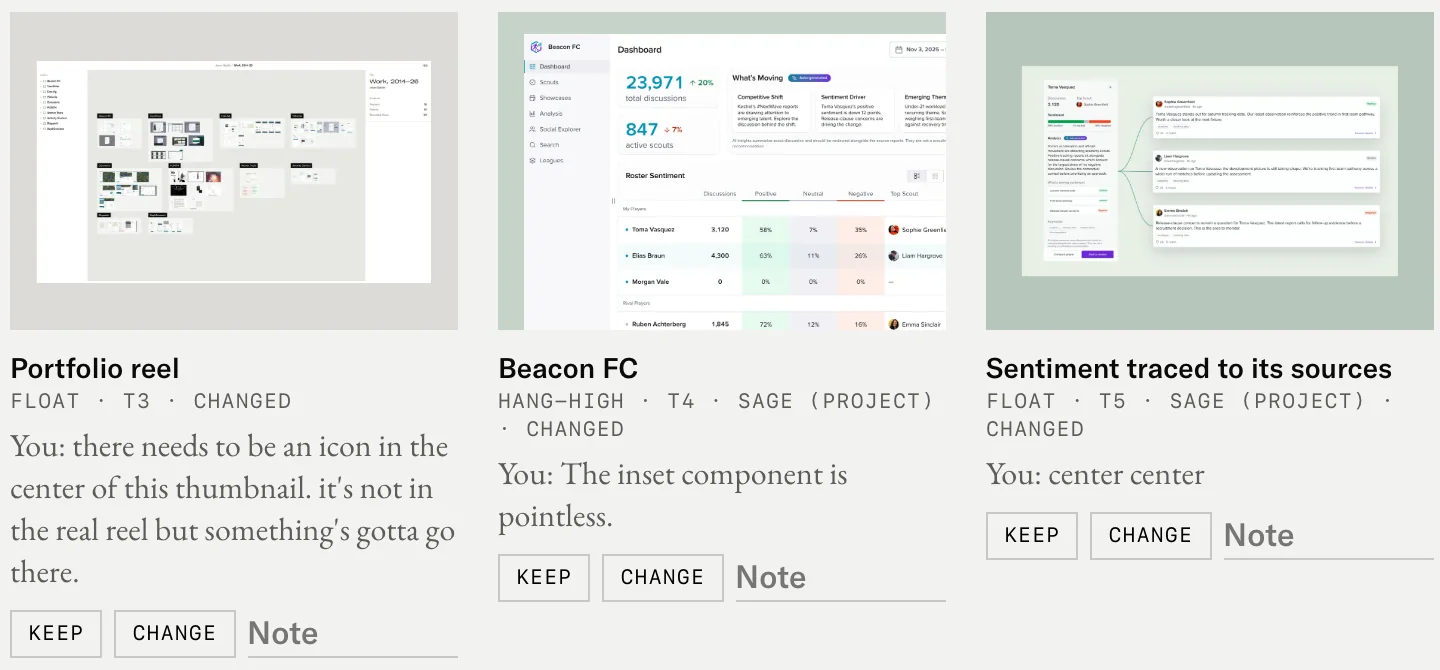
On the first pass, I kept 128 cards. On the second, I kept 49 of the 53 I’d flagged, which left only four thumbnails to fix. After those, I’d be done with the wretched business of choosing thumbnails for my homepage.
My notes on them, though, read like a grumpy art director muttering to himself.
- Terrible thumbnail.
- most boring thumbnail
- Practically unreadable
- There are simply too many phone screens. we need some kind of variety.
- still lacking and hard to read
- it’s just so small and it doesn’t look like much
- Needs to be more of a cartoon
- boring thumb
Those four just simply didn’t pass the eye test, and fixing them by typing crop instructions to an agent and refreshing the browser was miserable. When you want to nudge a phone screen up until the useful rows sit in the middle of the frame,
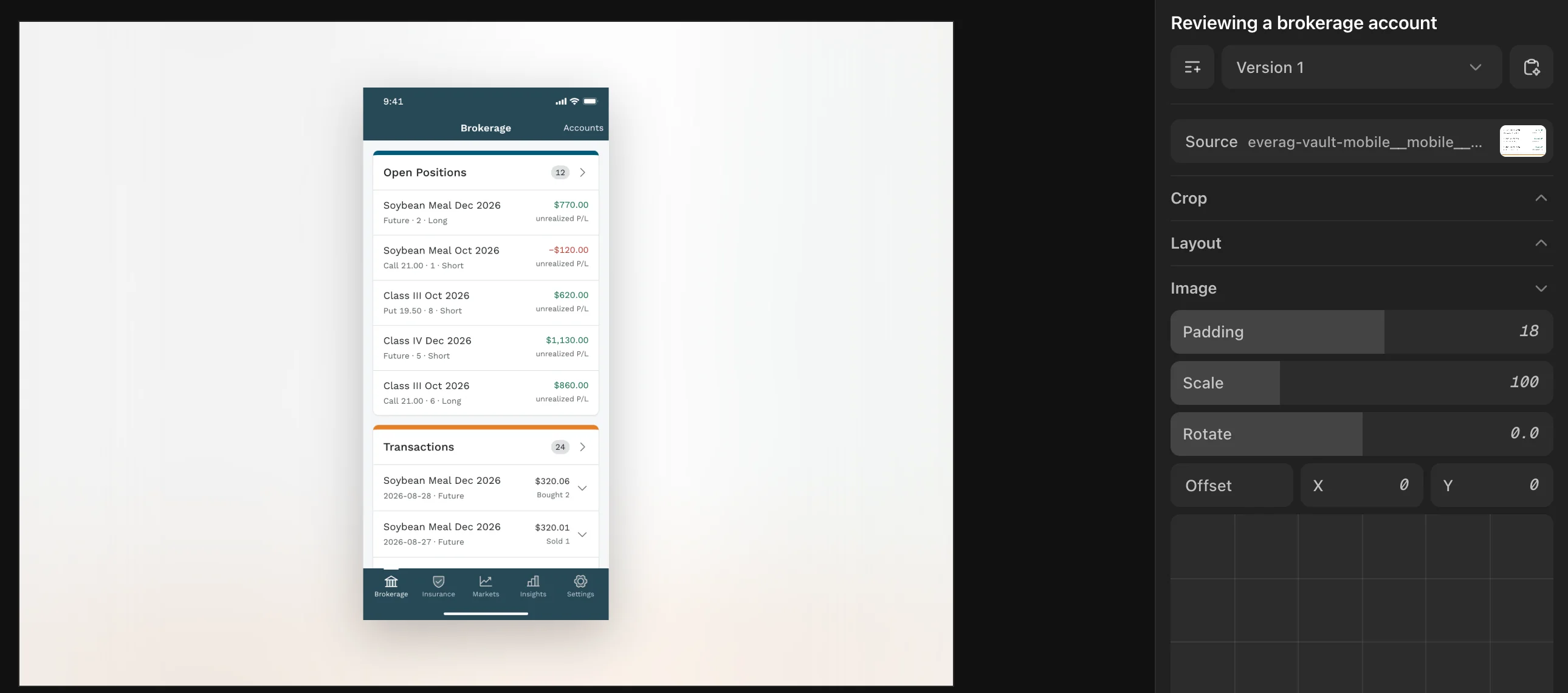
So I dropped Josh Puckett’s DialKit into a local page, planning to drag a few sliders on four cards and get back to my two-day portfolio.
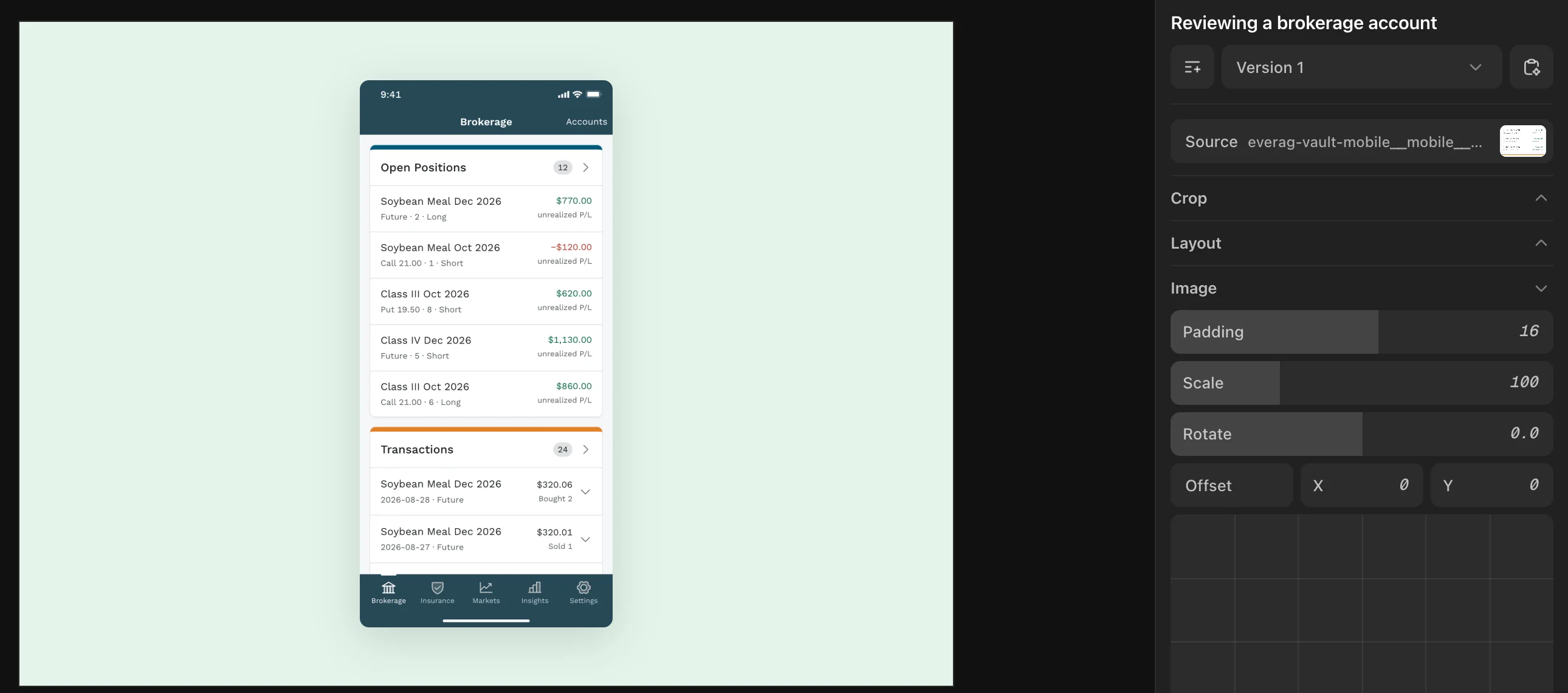
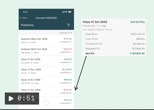
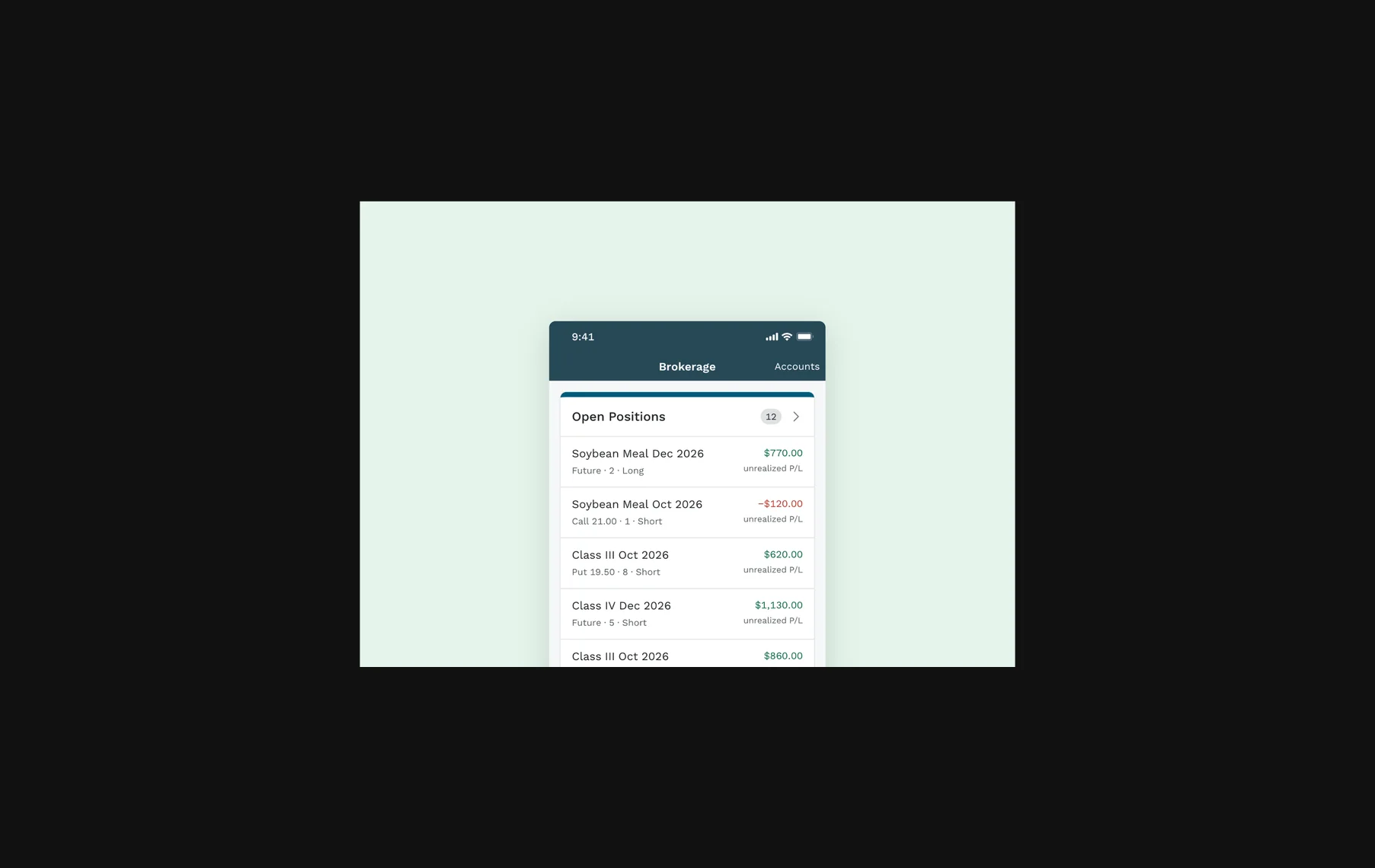
The first few controls fixed the brokerage card. I started by setting the screen on a pale green ground.
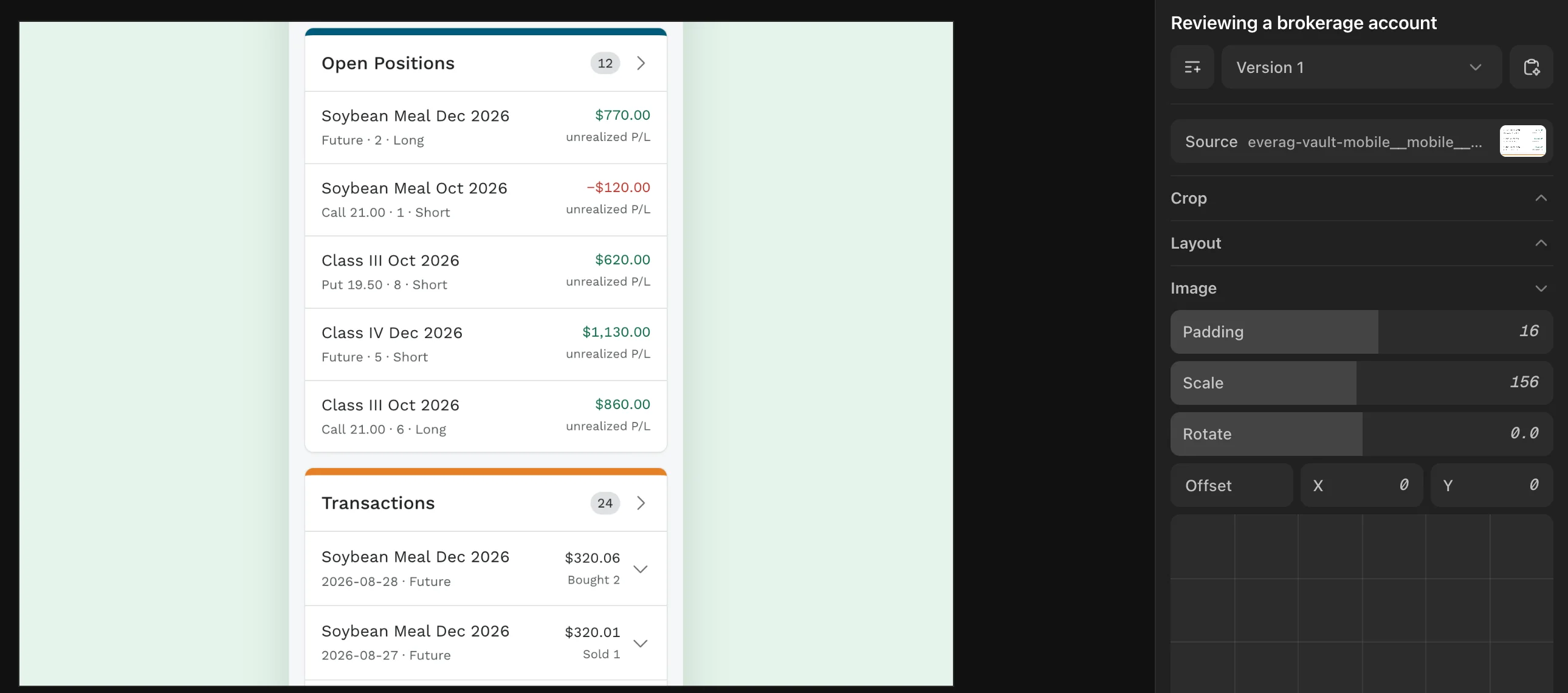
Then I scaled it up until the list ran past the edges of the frame.
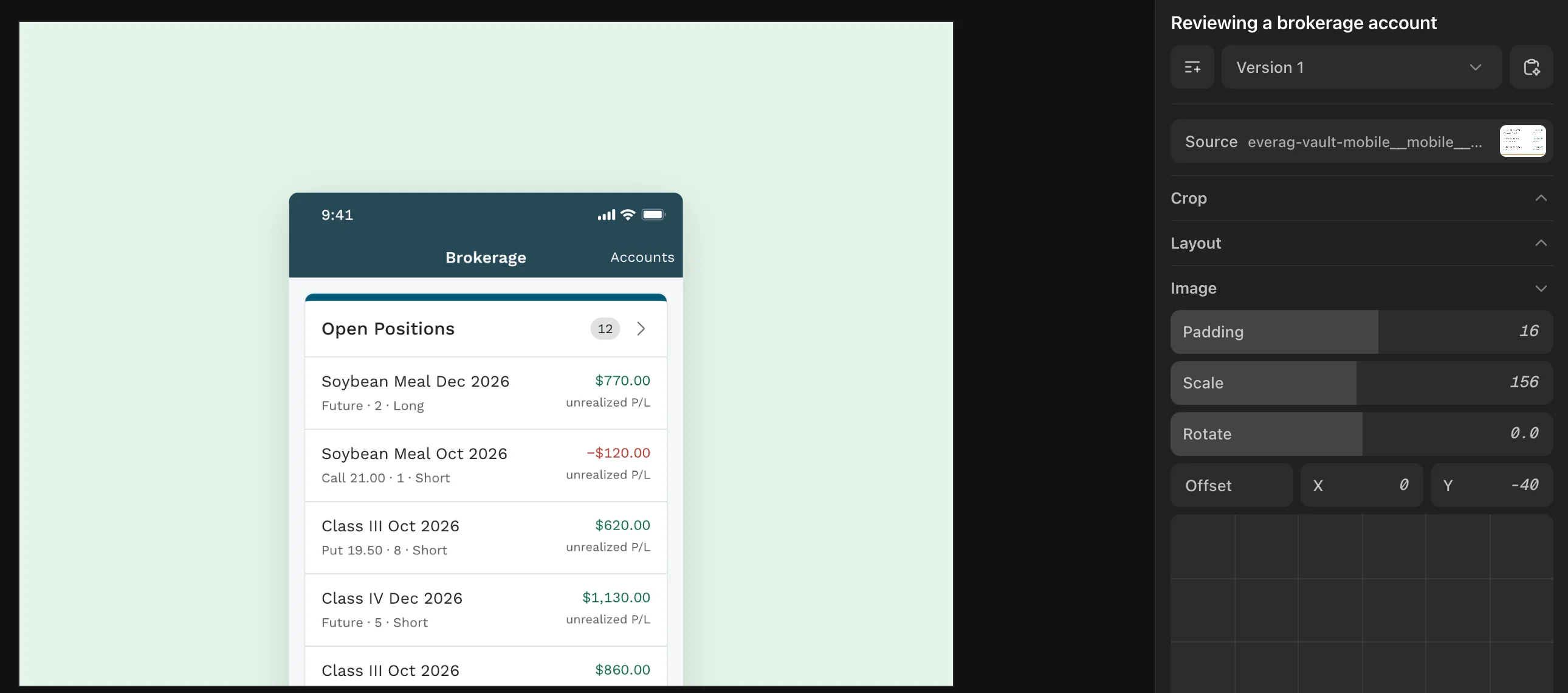
Last, I nudged it back down so the top of the phone showed again, with the positions list right under it. It finally showed the thing the screen was about.
Then adding one control made the next one obvious. Placing one phone screen made me want layouts for tilting several into a spread. Layouts made me want browser and phone frames, then inner mats and drop shadows, then palm and window-blind shadow overlays, then filters like halftone, dither, and ASCII. To give the backgrounds more life, I added a folder of 55 photographs I had taken myself and a collection of paper, wall, and gradient textures. I’d kept those photographs for years in a Google Photos album called Textures, looking for any excuse to use them, and this was finally it. Then we wired up one-click style presets and a gallery that rendered a card in every style at once, so I could pick a direction quickly and fine-tune it with the sliders.
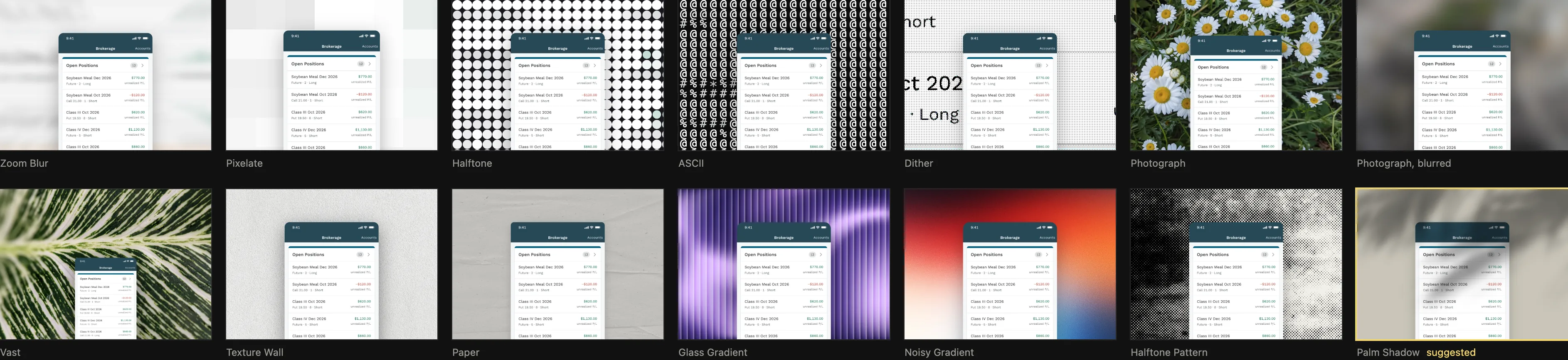
Looking at the preset gallery and the sidebar next to it, I realized I had rebuilt most of Reframe inside my portfolio repository. Reframe is a web app by Dan Petty for turning screenshots into polished images with custom sizes, colors, and effects. So I went and looked through it, since I might as well borrow its best ideas too.
The studio had the same flaw as every standalone mockup tool. It showed one thumbnail by itself in the middle of a dark workspace, where almost anything looks good. You spend five minutes getting it right, save it, put it on the page, and immediately see that it clashes with the card sitting next to it.
That’s when the stroke of brilliance struck. The studio’s preview was already a plain JavaScript function that could draw a thumbnail into any spot on a page, so nothing was keeping it on a separate one. The whole studio might as well live on the homepage itself.
On my local machine, opening the homepage with ?edit on the end puts a small pencil on every card in the grid. Clicking a pencil opens the DialKit panel and draws that card live, in its own spot, while the rest of the homepage sits untouched around it. I can drag a slider, pan the image, or run through the 33 presets from a bar at the bottom of the screen and watch the card change right next to its neighbors.
When I’ve tweaked a card just right, I just have to click Use as pick to save the settings. A build script then opens each pick in a headless browser, takes a clean still, and turns it into the WebP and AVIF images the live site serves. Visitors only ever get static images. Whenever a thumbnail bothers me, I open the homepage locally and fix it in place.
Needless to say, the whole portfolio undertaking took more than two days.